Friday, July 30, 2010

Grandfather

Title: Dear Old Grandfather
Software: Photoshop
Product: A photograph of a person on a horse, recolored

Synopsis: Fixing dust/scratch marks, fold marks, and recoloring the entire picture. Applied what we learned in the Family picture, to this picture, while learning how to also recolor a black and white photo using hue/saturation layers and many many quick masks and selections. Used many tools, such as canvas, patch, lasso, selection tools, etc.

Steps: First had to clean up the huge fold mark in the middle using various tools, such as patch tool and clone tool. Then I took a snapshot of it and used Dust & Scratches Option and took a snapshot of that. Then I worked in the snapshot before while my history tool used the snapshot of the Dust and Scratches one. This took off the scratches and dust marks. After, I had to select and save many parts and color them using hue/saturate layers.

Commentary: Very very tiresome because it was hard to figure out what some parts are. Overall, it turned out well, though.
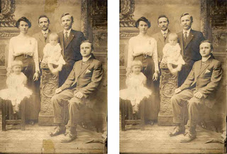
Family

Title: Family
Software: Photoshop
Product: An old photograph of a family

Synopsis: Touch up on an old family portrait. Learned to use the healing, spot healing, clone, and other tools to fix the picture. Left is the original and right is the fixed one. Learned how to use the dust and scratches option to make the picture more appealing. Also used the patch tool for various places. We had to take the tape off and remove most of the dust and scratches, and fix the right man's nose.

Steps: First, I had to remove the tape from the bottom and the top. This had to be done using various tools such as the healing, spot healing, patch, and clone tools. Then, I had to remove the scratches by going to Filter>Noise>Dust & Scratches. I learned to use this option to work in a snapshot I made before, while the history brush went back to the snapshot I made after I used the Dust and Scratches option. Thus, this made the picture much cleaner. Lastly, I used the Marquee tool to take a nose from one of the other men and jumped that to a new layer and moved it to the nose I had to fix. A few fixes, erases, and rotations to make it more natural.

Commentary: This was just a practice, but it was fun to learn. I am happy that I managed to keep the signature on the bottom where the tape had covered over it and that the nose looked much better.

Wednesday, July 28, 2010

Flawless Skin

Title: Flawless Skin
Software: Photoshop
Product: Before and After Photograph of a Girl

Synopsis: Completing this project entailed learning how to use layers, gaussian blur, and hue/saturation layers.

Steps: First, I fixed the blemishes on her face and the glare on her forehead, cheeks, and nose. Then I saved the background as a selection and used the gaussian blur to blur the picture. I erased the blur where details were needed and loaded the background selection. Then I quick masked different parts of the face to change the color using hue/saturation layers.

Commentary: It was thoroughly fun to change her face and add different colors to her. I am happy that she looks somewhat natural and that the blush blended into her face and not stick out like a drag queen.

Travelogy

Title: Travelogy
Software: Photoshop
Product: Travel Poster for a Travel Agency

Synopsis: To complete this assignment, I had to use the quick mask tool to delete unnecessary parts or make things transparent and make different pictures fit in with a combination of gradient tool and quick mask tool. Also, I had to make the font have special effects.

Steps: First, I took one of the stock photographs given to the class and then looked for two more pictures to use. I cropped and took unnecessary parts out using the eraser, quick mask, and other tools. Then, I placed it in the background picture, making sure the resolution is correct. Then I worked on the type and used emboss and special effects.

Commentary: The girl is a bit transparent and small, but by this time I had switched three photos in and out due to criticism, so that girl is staying. I was happy with how the wind surfer looks natural with the background.

Tuesday, July 27, 2010

Nexto

Title: Nexto
Software: Photoshop
Product: Travel Agency Poster

Synopsis: To finish this assignment, I had to use emboss for the text and make it have special effects. I also had to use the quick mask and canvas tools.

Steps: First, after opening the document, I had to use the canvas tool to make the height larger. Then, I used another layer and used a gradient that's close to the color of the top of the picture and I used the gradient tool with the quick mask tool to make it more natural and have a smooth transition. Afterwards, I put the cell phone and airplane pictures on top and used the quick mask tool to delete the unnecessary and make the cell phone picture blend in and be somewhat transparent. Lastly, I typed the words below and used emboss and special effects.

Commentary: Apparently the name was supposed to be Nextco. Imagine a C between the T and the O =). It was interesting to learn, though the airplane just doesn't match. Well, it was just a lesson, though I do like my type.

Commodities to Culture Article

Title: Commodities to Culture
Software: Photoshop
Product: Article about Commodities to Culture

Synopsis: To finish this project, I was to take the background out of every photo I used, using various tools to test how well I know Photoshop tools. I had to make thumbnails and a rough before making the final on the computer and space everything evenly. It also tests my typographic knowledge.

Steps: First, I created several thumbnails and selected one I found one I liked the most. Then, I made a rough with spacing labelled, and after that was shown to the teacher, I made it on the computer. I opened the document and put each box in a separate layer. Then, I used pictures I found on the internet and opened them in different documents to crop using various tools such as the quick selection, wand, lasso, and magnetic lasso. Then I dragged them into the main document and made sure each were in the right resolution and cropped to the right size. Each were in a different layer as well. Then I put the type on and used different fonts. I put strokes on the boxes at the end to decorate it more.

Commentary: Quality lowered makes me sad. This project took a bit more time than others, but it was fun, especially looking for pictures and silly arguments about who got the picture first, since we were supposed to get non-copyrighted pictures. I am glad that it turned out very nicely, though it seems some pictures were harder to crop than others.

Zoo Postcard

Title: LA Zoo Postcard
Software: Photoshop
Product: Zoo Postcard

Synopsis: The objective of this project was to test our abilities to resize photos, understand resolution, crop photos, combine photos, align layers, and stroke a selection.

Steps: I had to create a postcard using the template that the assignment gave and follow directions to check resolution, crop, and add strokes. First, I picked the five images I was going to use and I checked the resolution to be 300, cropped, added 38px stroke, and then moved to the main document. I put a stroke on the background on the main document and color to the background. I added the text and changed the fonts so that it was more appealing.

Commentary: It was an exercise to use image size and resizing in Photoshop. I got a 98, 2 points docked off for having somewhat light font at the bottom. It looked pretty while it was in Photoshop. Then it met "Save for Web & Devices" and became somewhat not so pretty anymore.